The D&T Framework in 2004 brought together some useful tools for the teaching of design skills, such as ACCESS FM, Winners and Losers, 4X4, SCAMPER, etc (see Module 4: Teaching the subskills of designing). Unfortunately, the roll-out of the training was a bit patchy (to say the least) so there has been a mixed experience in schools. This can manifest in two ways: firstly, in some schools the strategies were not adopted to help children learn the skills of designing (including exploring, generating, developing, planning and evaluating); secondly, in the breadth of activities being used and the sophistication of use, never mind the confidence to adapt and develop strategies was limited – sometimes causing frustration and rejection! However, some activities have been widely adopted.
I’ve been thinking recently about the use of acronyms, in particular, such as ACCESS FM[1. aesthetics, customer, cost, environment, size, safety, function, materials] and SCAMPER[2. substitute, combine, adapt, modify, purpose, eliminate, rearrange]. There is nothing special about these acronyms, other than the fact that they are memorable (mnemonics) and each ‘heading’ (e.g. ‘customer’ in ACCESS FM) may not be useful or appropriate in each situation. However, they are useful cognitive tools, that can help teachers and children to build design thinking and strategies – as well as highlight links between the material areas in D&T. But like any tools, the require a certain level of skill in use.
So how do I use an acronym (or any of the strategies)?
There are two ‘extremes’ that you will be working between when you adopt and use a design tool like ACCESS FM:
- Rigid (scaffolded[3. Note: there is an element of scaffolding AND facilitation at both ‘extremes’]) use of all the headings in a teacher lead activity.
- Flexible (facilitated) adaption by the learner(s) in an independent maker.
When leaning towards the former approach, the teacher needs to consider the learners’ age, ability, prior experience and the context of the activity. Assuming the learners will understand what is expected is a common mistake, as the meanings of the ‘headings’ can be unclear (e.g. aesthetics). So there are at least three choices to make at this point: (a) define the meaning, (b) use examples, and (c) use prompt questions or explanations. There is an excellent opportunity for developing literacy in the use of technical language here, through worksheets, glossaries, word walls etc.
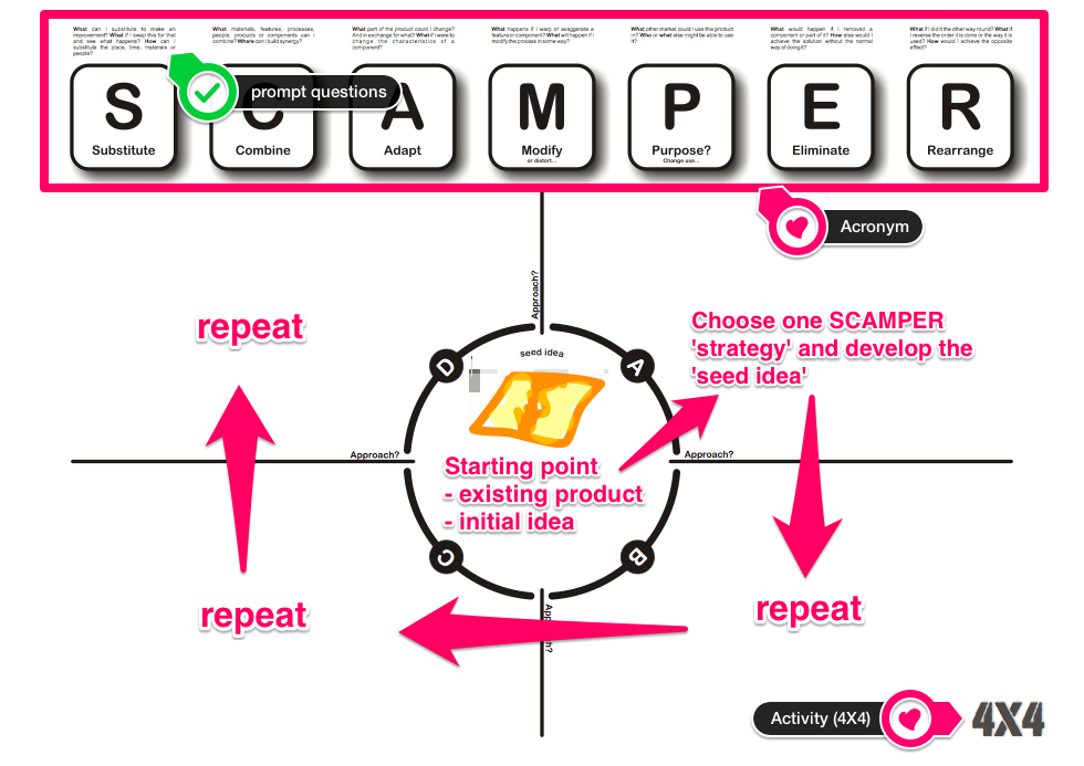
Other choices to make include: changing unfamiliar words to more familiar ones (e.g. ‘aesthetics’ for ‘appearance’); or removing headings to reduce the number (e.g. ACCESS FM could become FACE – function, appearance, customer, environment). The annotated worksheet below, combines the SCAMPER strategy (page 380) with and activity called 4X4 (page 371). Notice how the worksheet includes the SCAMPER acronym (top), with prompts (above) and the main 4X4 activity clearly laid out (main section). This is a scaffolded activity, rather than a style of presenting a design development sheet, but might be an appropriate starting point for Key Stage 3 (KS3) learners. The aim being that as confidence grows, learners employ and adapt a range of strategies independently. So a similar activity with Year 9s or 10s might have an A3 page folded twice to create 4 boxes, with the teacher using examples, a slideshow and/or a poster to remind/prompt about the the strategy.
[Click here to download the worksheet above]
The key to using design activities like this is good teacher modelling, when first introducing them to learners. It is also important not to use them as the only form of design activity, so children have to opportunity to apply what they learn (e.g. sketching, combining materials, making a prototype etc.), and are not thrown when they are faced with a ‘blank page’ for the first time. Teacher modelling can include demonstrating, explaining and questioning, each of which can[4. …and should, in most cases.] be achieved ‘live’ in the lesson or through learning resources (worksheet, posters, presentations, videos etc.). When beginning with a new approach, a ‘worked example’ (demonstration) can show learners what is expected. This is most effective when you demonstrate using the same materials and format to the learners, so using a visualiser, video camera or if you don’t have access to either, gather the learners around a table[4. Remember that they can’t see what you can see]. To avoid stifling creativity, you might use a different context to that of the lesson, so that you don’t lead learners to particular solutions[5. i.e. “This is what the teachers must want.”].
When working with older or more confident learners, you could begin to be more flexible. For example, when using the 4X4 activity encourage them to use the strategies that are helpful if and when they need them – i.e. to help to prompt thinking, if they don’t have any immediate ideas. This returns us to the concept at the beginning of this blog post, that the activities are nothing special in themselves and a certainly not ‘designing’, but rather learning aids or scaffolds to developing design skills – enabling learners to become more confident and well rounded design thinkers.
See previous blog post: Quick and dirty product analysis


